Kerning tutorial ↩
- Some tips before you start
- Kerning workflow
- Defining kerning groups
- Defining kerning pairs
- Proofing kerning in UFO
- Proofing kerning in OpenType fonts
This page describes the kerning process using RoboFont’s built-in tools:
- Groups Editor to create kerning groups
- Kern Center to create kerning pairs
- Space Center to preview kerning
While other kerning tools and methods exist, the general principle of grouping glyphs based on their left/right shapes and adjusting pairs is the same.
Some tips before you start
Drawing and spacing come before kerning. Kerning should not be used to fix drawing or spacing problems. Because of that, kerning is usually done towards the end of the design and production process.
Too many kerning pairs is usually a sign of bad spacing and bad font engineering: it makes font files larger and typesetting engines slower. The bigger the character set of the font, the more it pays off to keep groups and pairs to a reasonable minimum.
Kerning workflow
The kerning process involves the following main steps, which can be repeated iteratively until you’re satisfied with the result:
Let’s have a closer look at each one of these steps.
Defining kerning groups
The logic behind the definition of kerning groups is simple: glyphs which share the same left- or right-side shape belong together in the same group. Of course, shape similarity depends on the typeface we’re working on.
Examples
As a reference, let’s have a look at kerning groups extracted from real fonts.
For clarity, the groups have been simplified to show lowercase and uppercase latin glyphs only. Accented letters, ligatures, etc. are not listed below, but should also be included in each group. The fonts also contain other groups (for punctuation characters, non-latin alphabets, etc.) which are not shown here.
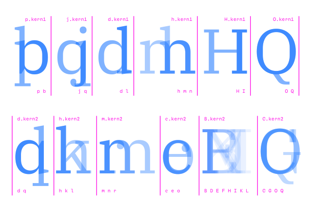
The first example is a serif text typeface:
# kern1 (glyphs with the same RIGHT side)
pb jq dl hmn HI OQ

# kern2 (glyphs with the same LEFT side)
dq hkl mnr ceo BDEFHIKLMNPR CGOQ
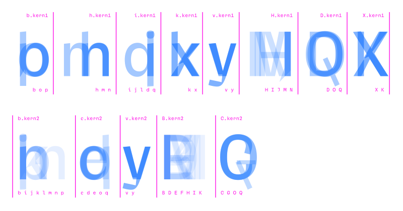
The second is a sans-serif design:
# kern1 (glyphs with the same RIGHT side)
bop hmn ijldq kx vwy HIJMN DOQ VW XK

# kern2 (glyphs with the same LEFT side)
bijklmnprh cdeoq vwy BDEFHIKLMNPR CGOQ VW
Applying the same method to other typeface styles will produce different patterns. What’s important here is the general principle of grouping glyphs based on their left- and right-side shapes.
Creating and editing kerning groups
Kerning groups can be created and edited using the Groups Editor:
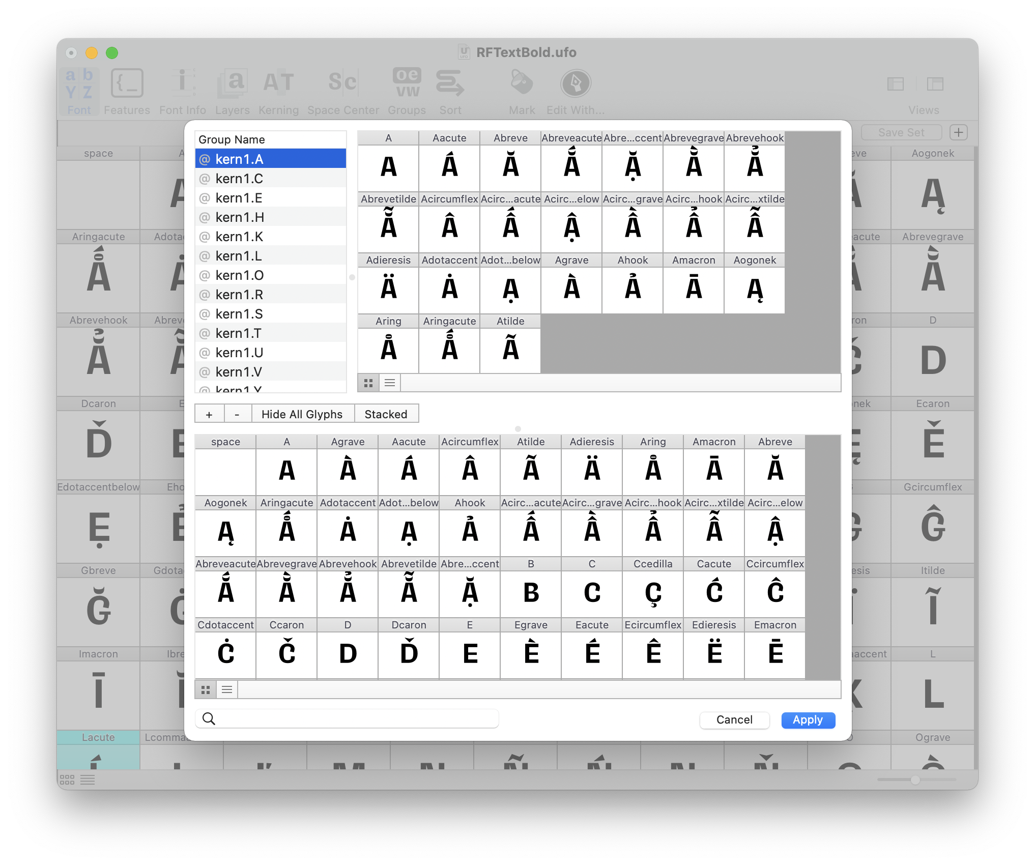
- use the
+button to create new left/right kerning groups - click on Show All Glyphs the reveal the full glyph set
- add glyphs to groups by dragging them from the glyph set into the selected group
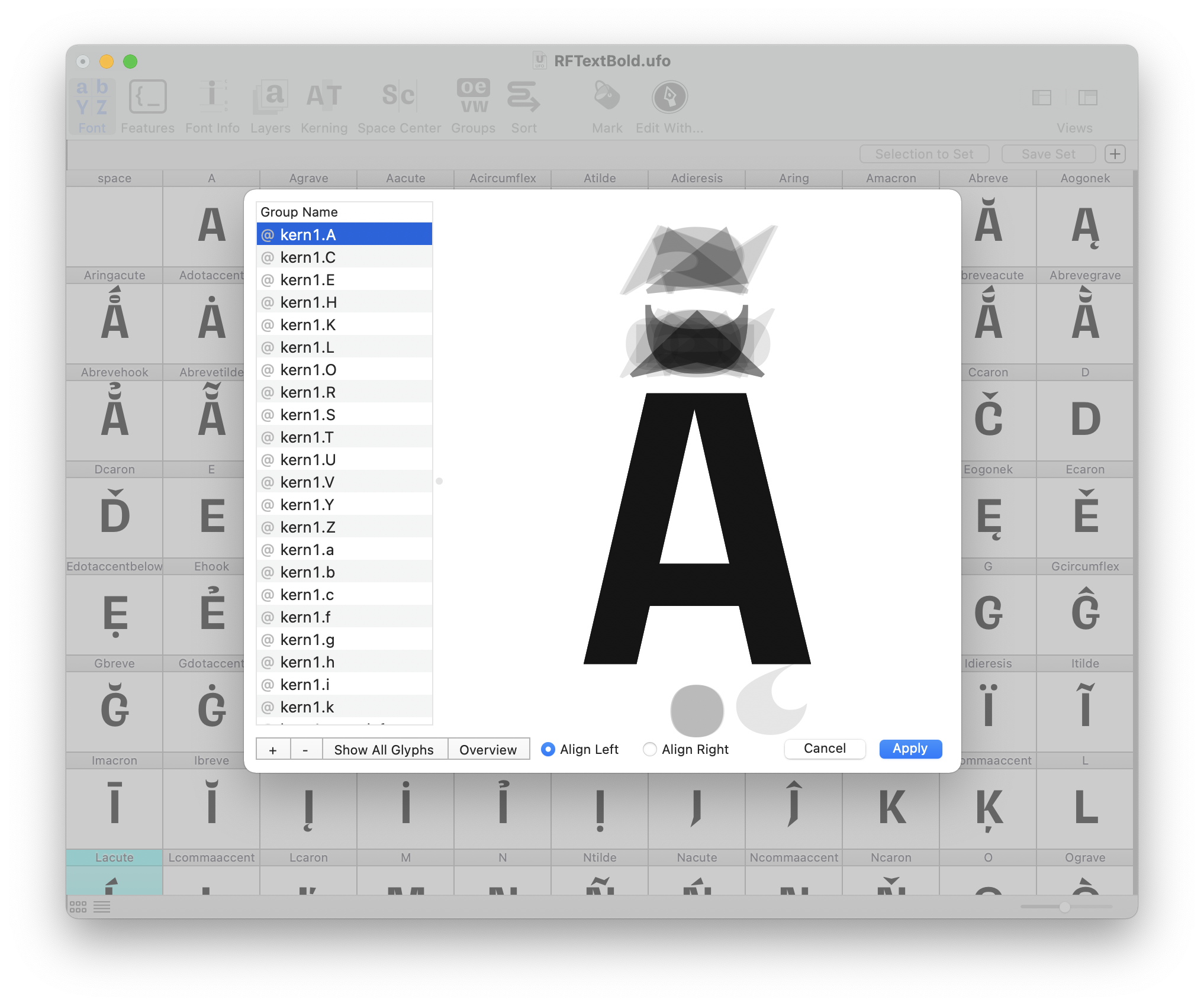
- use the Stacked view to check if left/right shapes are matching
Defining kerning pairs
Once the kerning groups have been defined, we can move on to determine which combinations should be kerned, and by how much. There are basically two approaches to that:
Using a pre-defined list of pairs
It’s easy to find lists with the most commonly used kerning pairs. We can also create our own lists by analyzing kerning in a set of fonts. Here’s an example:
AT AV AW AY FA LT LV LW LY PA TA VA WA YA
Ta Te To Va Ve Vo Ya Ye Yo Yu
F. F, L’ L” P. P, T. T, T- V. V, W. W, Y. Y,
f’ f” f) f] f} r. r, v. v, w,. w, y. y.
(j [j {j
- advantage
- A pre-defined list speeds up the process by directing our focus to the most problematic pairs.
- disadvantage
- There may be other pairs in the font which need kerning, and are not included in the list – we will not be able to spot them.
Testing possible combinations
A more systematic approach is to test all combinations between different categories of glyphs: uppercase/uppercase, uppercase/lowercase, lowercase/punctuation, etc.
Some combinations will only rarely appear in text. For example, pairs between lowercase/uppercase or pairs between letters and figures – is it worth to kern them? Something to think about and decide.
Here’s a table showing combinations between the main glyph categories. This helps to visualize which types of pair should be kerned, and which ones could be skipped.
| lowercase2 | uppercase2 | figures2 | punctuation2 | |
|---|---|---|---|---|
| lowercase1 | kern | maybe? | ✕ | kern |
| uppercase1 | kern | kern | ✕ | kern |
| figures1 | ✕ | ✕ | kern | kern |
| punctuation1 | ✕ | ✕ | ✕ | kern |
- disadvantage
- This method takes considerably more time, since we need to go through all combinations in order to decide which ones to kern.
- advantage
- The advantage is that, once we’re done, we’ll have covered all relevant combinations. Nothing is left out.
# glyph groups
from string import ascii_lowercase as lowercase
from string import ascii_uppercase as uppercase
figures = ['one', 'two', 'three', 'four', 'five', 'six', 'seven', 'eight', 'nine']
punctuation = ['underscore', 'hyphen', 'endash', 'emdash', 'parenleft',
               'parenright', 'period', 'comma', 'colon', 'semicolon', 'exclam', 'question']

# functions
def printPairList(first, second):
    for eachF in first:
        for eachS in second:
            print(f'{eachF} {eachS}')


# variables
maybe = True

# this table mimics the one above in the article
combinationsTable = [
    # lower2   # upper2   # fig2   # punct2
    [True,       maybe,     False,   True],    # lowercase1
    [True,       True,      False,   False],   # uppercase1
    [False,      False,     True,    True],    # figures1
    [False,      False,     False,   True],    # punctuation1
]
groupSequence = [lowercase, uppercase, figures, punctuation]

for jj, eachRow in enumerate(combinationsTable):
    for ii, shouldKern in enumerate(eachRow):

        if shouldKern:
            first = groupSequence[jj]
            second = groupSequence[ii]
            printPairList(first, second)
Creating and editing kerning pairs
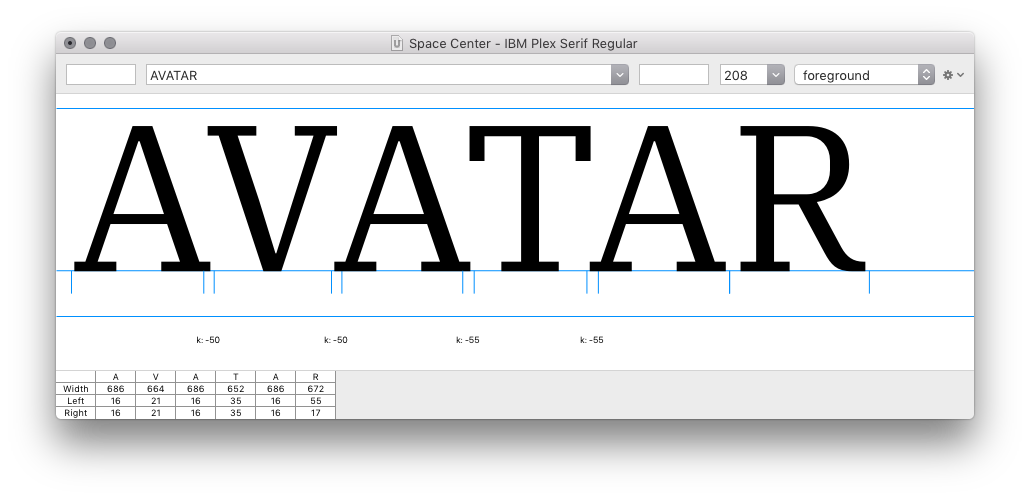
Kerning pairs can be created and edited in the Kern Center. It’s also a good idea to have the Space Center open, in order to preview each pair in context of other characters. Here’s a suggested workflow using both windows:
-
Open the Kern Center and paste a space-separated list of pairs. A preview of all kerning pairs will be shown. Click between the glyphs in each pair to interactively modify the kerning distance between them. Newly added pairs will appear in the list at the top of the window.
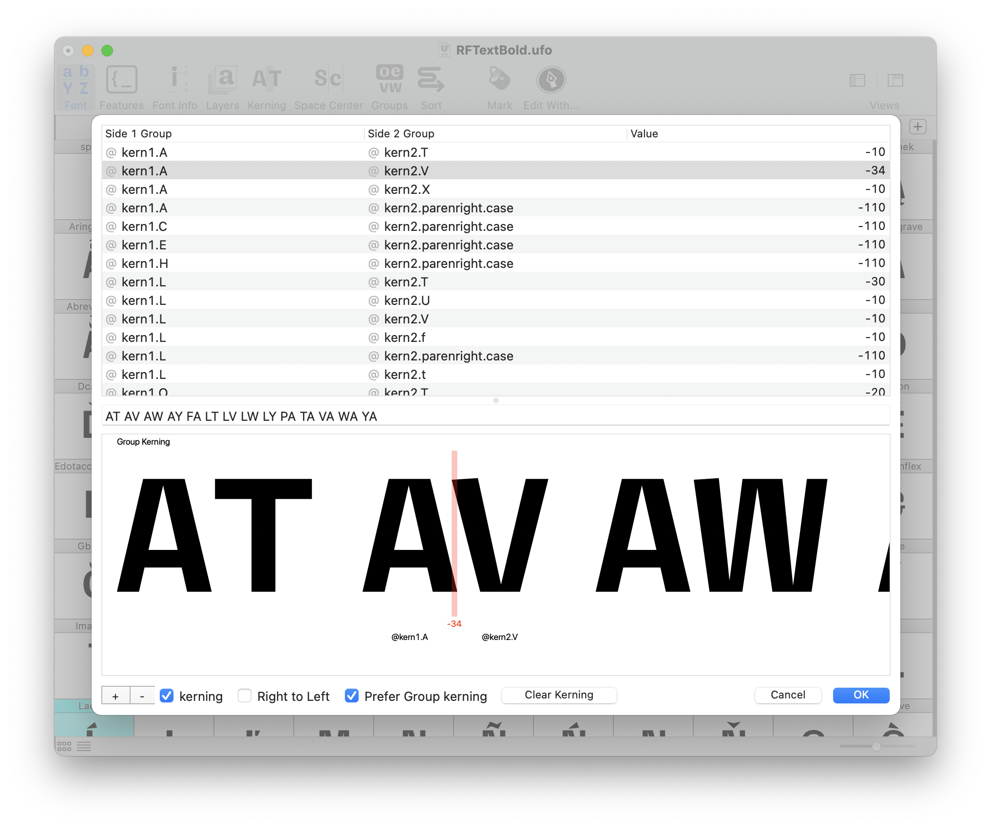
When a new kerning pair is created, RoboFont will first try to use kerning groups for both glyphs. If there is no kerning group for a given glyph, the plain glyph is used instead.
-
While you’re adding kerning pairs, open the Space Center and load a multi-line control string for all pairs. This will help you to check if the assigned kerning value is appropriate.
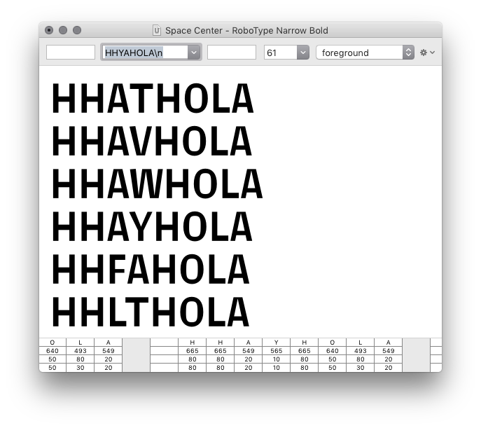
A useful control string for kerning pairs should contain a mix of:
- straight-sided characters (
HH) - straight- / round-sided characters (
HO) - a pair with large whitespace (ex:
LA)
- straight-sided characters (
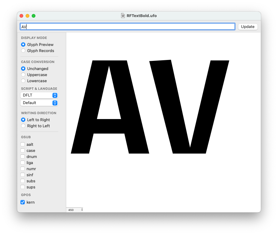
Proofing kerning in UFO
Kerning in UFOs can be previewed in the Space Center if the Show Kerning is selected in the display options menu.
If the option Show Metrics is selected, the kerning values will be displayed between glyph pairs if available.
Proofing kerning in OpenType fonts
There are several techniques to proof kerning, inside or outside RoboFont. Here are two examples.
Using the Feature Preview extension
You can use the Feature Preview extension by Frederik Berlaen. Remember to check the kern checkbox to activate kerning.
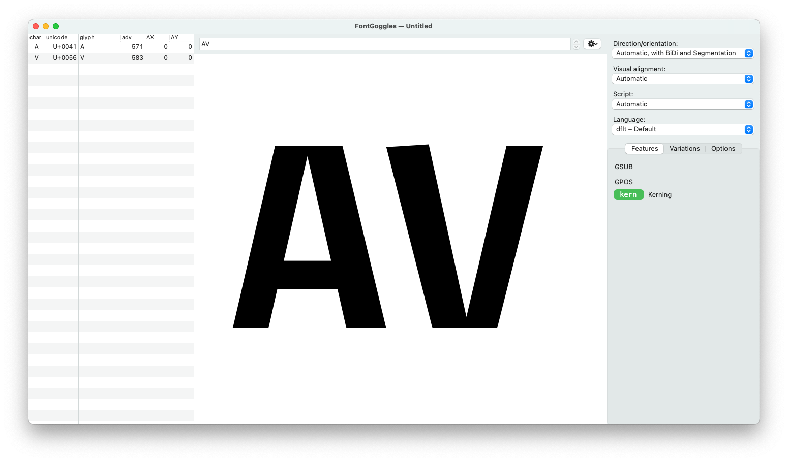
Using FontGoogles
You can use the FontGoogles application to proof your kerning. It is a desktop application for macOS by Just van Rossum, free and open-source.
Using test install and DrawBot
If you feel the urge to program your own solution, RoboFont is the right place to be. You could test install the font on your machine and typeset some text using the Drawbot extension inside RoboFont. Of course, you can install it with Mechanic2.
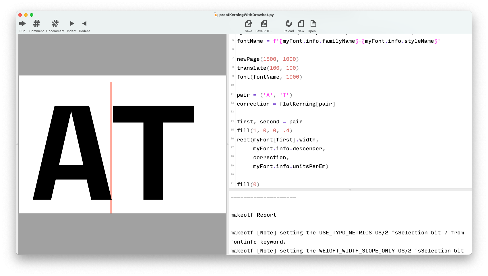
myFont = CurrentFont()
flatKerning = myFont.getFlatKerning()

myFont.testInstall(decompose=True, checkOutlines=True)
fontName = f'{myFont.info.familyName}-{myFont.info.styleName}'

newPage(1500, 1000)
translate(100, 100)
font(fontName, 1000)

pair = ('A', 'T')
correction = flatKerning[pair]

first, second = pair
fill(1, 0, 0, .4)
rect(myFont[first].width,
     myFont.info.descender,
     correction,
     myFont.info.unitsPerEm)

fill(0)
text(f"{first}{second}", (0, 0))