Introduction to spacing ↩
This page describes a general method for spacing glyphs.
The basics
Spacing is the process of adjusting the margins of each glyph, so that the white spaces between the glyphs and the white spaces inside the glyphs are visually balanced.

The ultimate goal of spacing is to produce a pleasant text image for reading.
Spacing and drawing are usually done in parallel – the black shapes define the white, and the other way around.
In RoboFont, spacing is visualized and edited in the Space Center.
Spacing vs. Kerning
Spacing comes before kerningThe local optimization of whitespace between pairs of glyphs by adding/subtracting a certain amount of units from the default spacing.. Kerning should be done later in the design process, once the spacing has been established. Kerning should not be used to fix problems caused by bad spacing.
Modularity in spacing
Black shapes are created by repeating certain elements (stems, bowls, arches, etc). The patterns of white shapes are formed around shapes with similar edges.

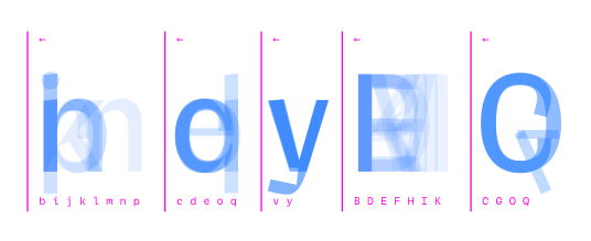
Spacing the lowercase
Define values for straight sides
Start by defining sidebearings for shapes with straight edges – this group is typically represented by the n.
Type in a string of ns, then adjust the values for left / right margins to create the base rhythm of your lowercase.
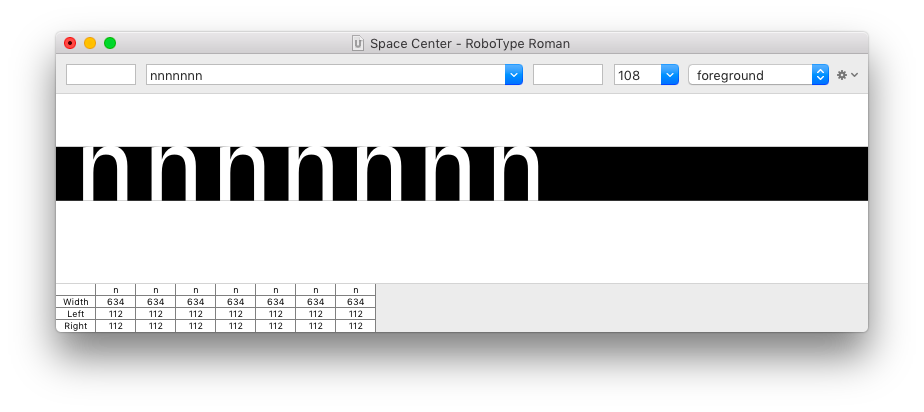
The Cut Off display mode helps to visualize the space between and inside glyphs. You can edit the size of the Cut Off section using cmd ⌘ + drag
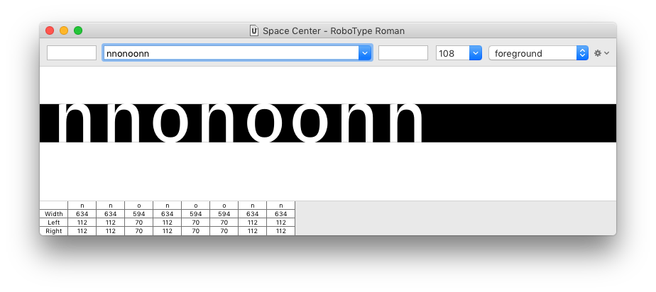
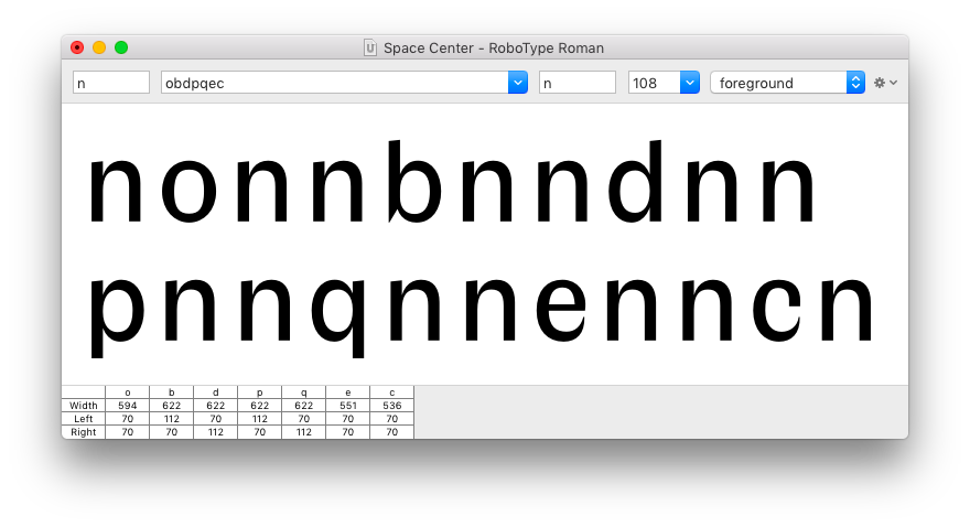
Define values for round sides
Based on the straight sides, you can now define the round sides using the o.
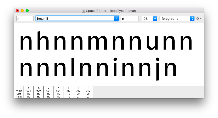
Transfer margins to other glyphs
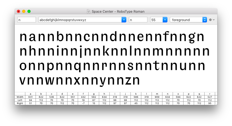
After the margins for straight and round sides have been defined, you can move on and transfer these values to all other glyphs with a matching edge shape.
For example: take the left margin from n and copy it to the left margin of all the other glyphs which have a straight left side (m, h, l, b, p, etc).
Here’s a visualisation of these relationships as a table:
| left margin | right margin | |
|---|---|---|
| straight | n h m u l i j k b p r | n h m u l i j |
| round | o c e d q | o b p |
| angled | v w y x | v w y x k |
Use the pre / after input fields to create the reference pattern for spacing.
You can type in expressions like =n into the input fields, and they will be converted into the actual numerical value equal to n.
Depending on the design (for example a serif or italic type), you may need to turn on the beam to measure margins from the stems and not from the edge of the shape.
The same is done for characters with round sides…
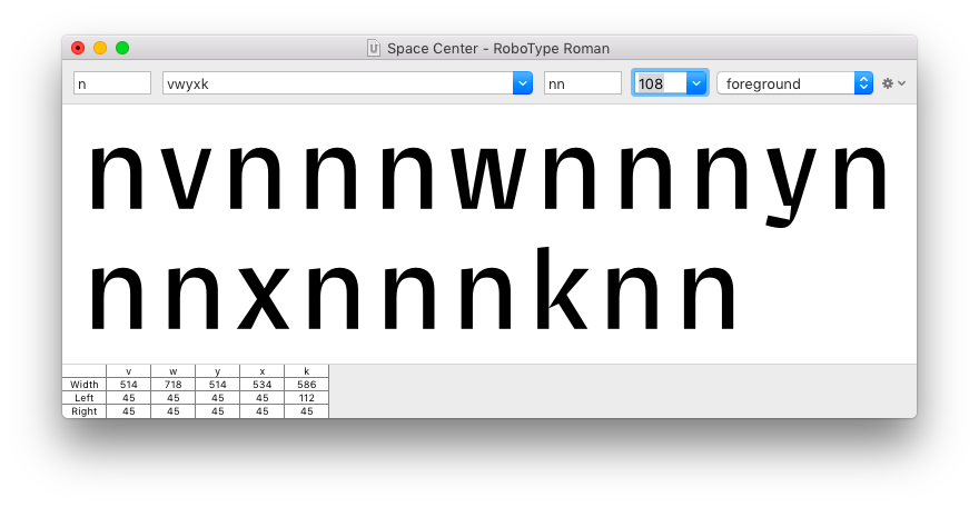
…and characters with angled sides:
And finally, the remaining lowercase glyphs are adjusted visually to fit the rhythm of the other glyphs.
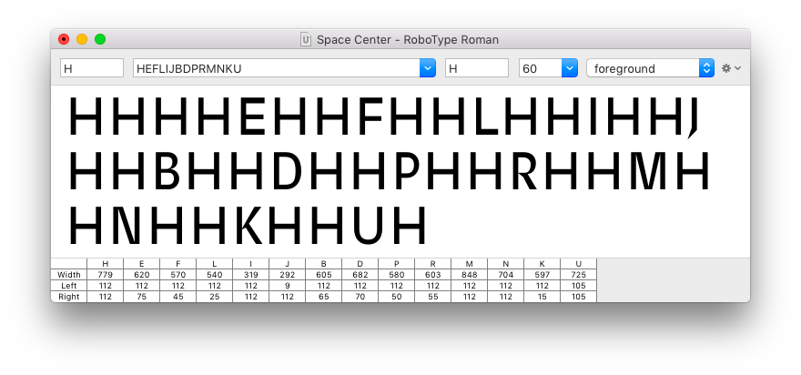
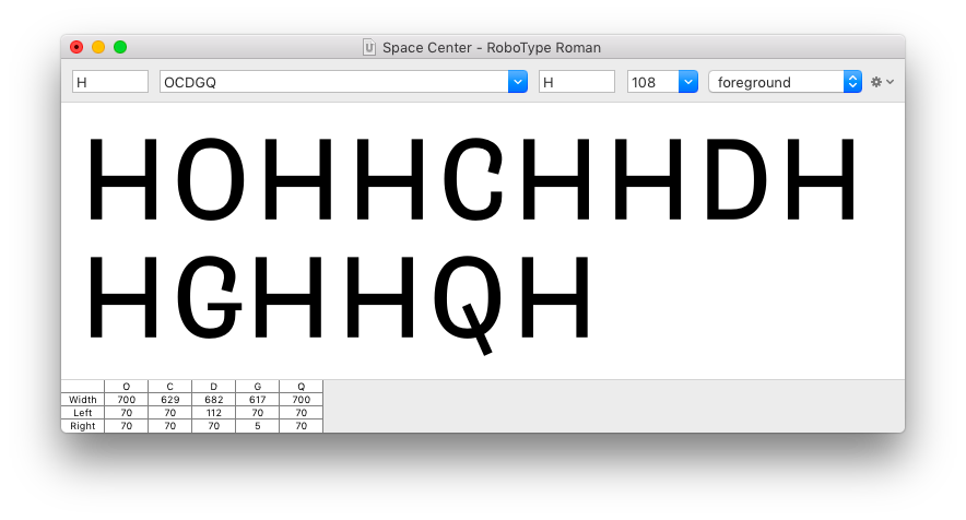
Spacing the uppercase
The same process is used to define the margins for the uppercase glyphs.
| left margin | right margin | |
|---|---|---|
| straight | H E F L I B D P R M N K | H I J |
| round | O C G Q | O D Q |
| angled | V W Y A X | V W Y A X K |
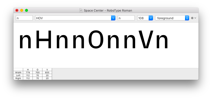
We start by defining the margins for H (straight sides) and O (round sides)…
…then proceed to copy those values to all other glyphs with matching edge shapes, and finally take care of the remaining glyphs.
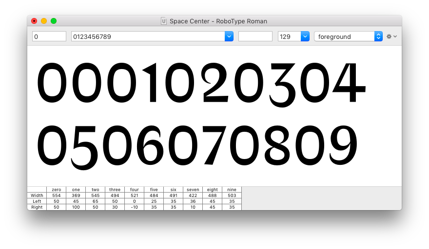
Other groups of glyphs
When spacing numbers, we can use 0 as the base glyph.
- Letters Of Credit – Walter Tracy
- Counterpunch - Fred Smeijers
- Approaches to applying spacing methods… – Fernando Mello
- Spacing a font, Part 1 & 2 – Society Of Fonts